Quick answer
The best OnlyFans background ideas do more than look tidy: they tell the viewer what kind of scene they are entering, hold up when the camera moves, and match the pace of the content you actually post. Use this page to pick backgrounds by mood, by format, and by failure risk, so you can stop guessing, stop reshooting, and build a set that feels intentional in both photos and video.
For neutral context, this guide cross-checks the topic against Creator economy and Goldman Sachs Research's creator economy outlook. So the recommendation is grounded in external market signals rather than only product claims.
If you are only hunting for lighting or camera gear, this is the wrong page. If you want a background system that helps your feed feel recognizable, premium, and easier to repeat at home, keep going.
What most OnlyFans background ideas get wrong
Most advice starts with a room and then tries to decorate it. That sounds harmless, but it is backwards. A background is not just the space behind you; it is a cue that tells the viewer what kind of creator you are, how deliberate the set feels, and whether the post belongs to a brand or to a random camera roll.
That difference matters because the same room can send opposite signals. A bedroom with clean bedding can look intimate and controlled in one shoot, then look flat or cheap in the next if the frame never changes. A bathroom can feel playful in a still photo and then turn awkward the moment a mirror catches the phone or a bottle sits in the wrong place.
Creators who treat the background as part of the offer usually waste less time on retakes and end up with a feed that feels stable. That is the real job of the background: not decoration, but control.
Background as a persona signal
Color, texture, clutter level, and room choice all speak before the caption does. Soft fabrics and warm tones tend to read as intimate. Hard surfaces, darker corners, and stronger contrast push the frame toward edge, tension, or drama.
A luxe look usually comes from reducing noise, not buying more objects. A casual look can tolerate a little lived-in detail, but it still needs intent. Random mess reads as neglect; selective mess reads as style.
That is the missing step in most OnlyFans niche ideas guides: the niche name is not enough unless the room makes that niche visible. If the set says “I have no angle,” the content feels generic even when the posing is strong.
Why the same room works in photos but fails in video
Stills hide mistakes that video exposes immediately. A shelf edge enters frame, a mirror catches movement, a cable appears when the camera shifts two inches, and the room that looked polished in a photo suddenly feels cramped or noisy.
For that reason, background planning should start with motion, not with decor shopping. If the set only works from one exact standing point, it is fragile. If it survives a small pan and a small crop change, it is usable.
When you need a broader room-and-layout lens, the sister piece on OnlyFans studio setup covers storage, room choice, and how to keep a home setup functional. Use this page when you are deciding what the viewer should feel, not what equipment you should buy.
Where value drops: clutter, reflections, and weak privacy
The usual problem is not a bad room. It is one visible flaw that keeps repeating. Reflective surfaces, loose objects, and weak privacy make a set look less intentional than it really is.
That costs more than aesthetics. If you post three times a week and every third post shows the same distraction, the audience starts reading the account as less polished than it needs to be. A small visual mistake becomes a pattern, and a pattern is what people remember.
That is why background consistency matters for perceived value. A cleaner visual story makes the account easier to trust, and trust is what later makes premium offers feel believable. The monetization layer still depends on the scene looking stable first.
| Background signal | What it tells the viewer | When it fails | Best use |
|---|---|---|---|
| Warm fabric, low clutter | Soft, intimate, controlled | Looks flat if the frame never changes | Close photos, relaxed sets, softer personas |
| Clean surface, few objects | Premium, polished, deliberate | Feels sterile if the crop leaves too much blank wall | PPV stills, cover images, high-value posts |
| Dark wall, strong contrast | Edgy, dramatic, more intense | Dust, cables, and reflections show fast | Themed shoots, darker clips, stylized scenes |
| Casual room details | Relaxed, personal, less staged | Turns messy if the props feel random | Daily posts, casual clips, lighter moods |
Pick a background by the job it has to do
Do not ask only what looks good. Ask what the post needs to communicate. If the goal is intimacy, the frame should narrow the scene and calm the eye. If the goal is higher perceived value, the set should reduce noise and make the subject feel more deliberate by contrast.
That choice saves time later. A background that fits the job cuts retakes, shortens editing, and keeps the feed coherent. When creators change the mood every post without a rule, the account starts to feel like a folder of separate shoots instead of one brand.
For a deeper bridge between visual consistency and the business side, the guide on subscription pricing strategies shows how stable presentation supports retention. Background choices do not set the price by themselves, but they shape whether that price feels stable or random.
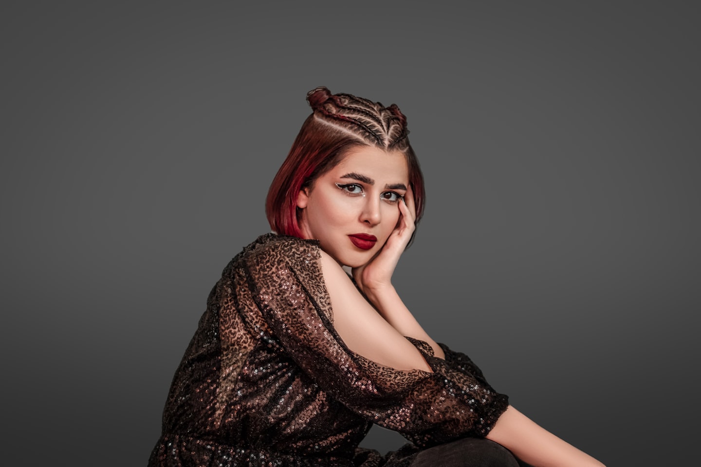
OnlyFans background ideas for intimate and soft sets
Use soft bedding, curtains, warm textiles, and low visual contrast. The room should feel quiet, private, and close. A bedroom can work here, but only if the crop is tight enough that the viewer sees texture instead of the whole room.
This style fails when the frame is too empty or too symmetrical. Soft does not mean blank. One lamp, one blanket fold, or one chair often does more than a pile of decorative extras.
Use this style when you want the background to stay present but never louder than the subject. It is a good fit for close framing, slow-paced photos, and posts that rely on warmth more than spectacle.
OnlyFans background ideas for clean and high-value sets
Choose fewer objects and better surfaces. Think clean wall, neat shelf, hidden storage, or one polished accent piece. The goal is a frame that feels controlled without turning into a corporate meeting room.
Clean sets fail when they become too empty. A premium look still needs shape. If the background is only blank wall and flat light, the post starts to feel unfinished rather than expensive.
This is the strongest choice for creators who want a more premium-first feed. It works especially well when the subject is the focus and the background only needs to signal discipline, care, and a little restraint.
OnlyFans background ideas for edgy and darker sets
Dark walls, shadow, metal, leather, and industrial textures can support a harder persona. Basements, garages, and stripped-down rooms often work because they reduce brightness and feel less domestic than a normal bedroom.
The tradeoff is that darker sets expose mistakes fast. Dust, cords, shiny edges, and random reflections show up sooner here than in lighter rooms. If the room is half-prepared, it does not look edgy; it looks unfinished.
Choose this style when the account needs tension, contrast, or a more intense mood. It is a strong option for stylized clips, but only if you can keep the frame clean from shot to shot.
OnlyFans background ideas for playful and casual sets
Casual sets work best when the room feels lived-in, not neglected. Kitchens, living spaces, and flexible home corners can support a lighter tone if the props stay intentional and the background still has one clear visual idea.
This style fails when the room starts telling a different story from the creator. Random household objects, mixed styles, or a half-cleared table make the set read as unplanned rather than relaxed.
Use casual backgrounds when you want the content to feel approachable and a little less staged. The trick is to keep the scene recognizable without letting it drift into ordinary clutter.
OnlyFans background ideas by scenario
| Scenario | Background signal to use | When it breaks | What to keep in frame |
|---|---|---|---|
| Soft intimate photo set | Warm fabric, low clutter | Busy decor, hard light spill | Bedding, texture, one accent |
| Premium PPV still | Clean surface, high contrast control | Visible storage, messy walls | One focal object, clean crop |
| Dark themed video | Shadow, depth, minimal reflection | Dust, mirrors, bright windows | Wall texture, controlled movement |
| Casual daily post | Relaxed room details | Random clutter, mixed styles | One or two familiar props |
If you only have time to test one thing, test the scenario first. A background that looks great in the wrong context is still the wrong background. The best choice is the one that makes your next five posts easier to plan, not just prettier on day one.

OnlyFans background ideas by content format
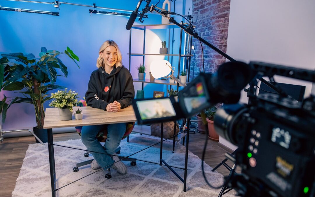
Photo and video are not the same problem. A still image can hide more than a clip can, and a short clip can expose every bad edge in the frame. If you post video often, the background has to survive motion, angle shifts, and a longer viewing time.
That difference matters because creators often build around the shot they like most, not the one they publish most. If the account is photo-heavy, the set can tolerate a little more static styling. If the account uses video as a core format, the room needs to stay clean even when the camera moves.
OnlyFans background ideas for photo sets
Photo sets benefit from one clear visual idea. The background can be simpler because the viewer reads it in a single glance. Texture matters more than movement, and a strong crop matters more than a crowded room.
Photos fail when the set is over-decorated. The eye has nowhere to land, and the subject stops owning the frame. A good photo background gives the subject room to lead instead of competing for attention.
If you are building stills for cover images, profile banners, or spaced-out feed posts, think in shapes and surfaces. One strong background cue is better than five tiny props that all fight for attention.
OnlyFans background ideas for video sets
Video backgrounds need more discipline. Everything visible should survive a small camera shift. Loose objects, mirrors, and shiny surfaces create problems faster than they do in photos.
A practical test helps here: if you can spot the same problem from three camera angles, the background is too fragile for video. If it only works from one exact position, it will probably fail the first time you move.
Video also makes privacy issues feel more immediate. Sound leakage, a visible hallway, or a bright window can change the tone of the entire clip, even if the room looked fine during setup.
OnlyFans background ideas for premium PPV sets
PPV sets need the strongest background discipline because the viewer expects more value. That does not mean the room must look expensive in the literal sense. It means the frame has to feel controlled enough to support the premium layer.
A simple background often wins here. The more the set supports focus, the easier it is for the content itself to carry the price signal. If the background is loud, the premium effect gets diluted before the content even starts.
This is where a repeatable background matters most. A stable visual pattern makes premium posts feel intentional instead of improvised.
OnlyFans backgrounds by format
| Format | What must stay still | What can move | Common failure |
|---|---|---|---|
| Photo | Texture, crop, subject framing | Small props, one accent item | Background competes with the subject |
| Video | Reflections, cables, shelf edges | Light movement, small pose changes | Clutter shows when the camera shifts |
| PPV | Clean visual story, controlled depth | Minimal motion, one or two props | Background feels casual when the content is positioned as premium |
OnlyFans backgrounds in small spaces
Small spaces can work better than larger rooms if the frame is managed tightly. A narrow crop hides more than it reveals, and a controlled corner often looks more intentional than an oversized room with too much empty space. The problem is rarely square footage; it is visual discipline.
In apartments and rentals, the goal is to build a background that can change fast without looking temporary. If every shoot requires a full reset, the set becomes hard to reuse, and the background stops being a system. That is where creators lose time and consistency.
Rental-safe swaps
Use textiles, removable props, movable furniture, and one or two repeatable accents. These changes are reversible and do not depend on drilling, painting, or permanent fixtures.
A blanket, curtain, or portable screen can change the mood faster than a pile of new objects. The background should move with the account, not lock the room into one look.
This is the easiest path if you rent, share a room, or need to reset the space quickly after filming. The best rental-safe change is the one that looks intentional in the frame and disappears when you are done.
Quick-change systems
Keep three background states ready: neutral, intimate, and themed. That gives you a fast way to vary posts without rebuilding the set every time. The win is operational, not decorative.
Creators who batch content usually need this most. A quick-change system cuts setup friction because the room no longer has to be rethought from scratch before every shoot day.
Use one base layout and change only the parts the camera can actually see. That keeps the account flexible without turning the room into a prop closet.
What to remove before shooting
Anything reflective, branded, or random should leave the frame first. Packages, cords, bins, extra mirrors, and stray household objects are the usual offenders. They are small, but they read loudly on camera.
If the room feels too plain after cleanup, add one intentional object instead of five filler objects. That keeps the set readable and avoids the “decorated at random” look.
When a background fails
Background failure usually shows up before the creator notices it. Viewers feel it as a drop in polish. The post still works, but it no longer feels like part of the same account.
That consistency problem matters because the audience compares each post against the last one. If the visual quality swings too much, the feed loses its premium rhythm. The account looks active, but not stable.
Too much clutter
Clutter turns the background into competition. The subject no longer owns the frame, and in small rooms one extra object can be the difference between intimate and messy.
If you can count more than five distinct items behind you, the set probably needs stripping down. The fix is subtraction, not a bigger budget.
Visible reflections
Mirrors, glossy tables, TV screens, and windows can all leak unwanted detail. In photo sets, that can sometimes be edited down. In video, it becomes much harder to hide.
Reflection problems are common in bathrooms and bright living spaces. They often show up only after the clip is already recorded, which is why they are so costly.
Weak privacy
If a room feels exposed, the creator’s body language changes. That change shows up on camera immediately. The set can be visually fine and still perform badly because the creator is not relaxed.
Privacy failures are not always about someone walking in. Sometimes they are about sound leakage, open windows, or the simple sense that the room cannot be used freely.
Inconsistent look across posts
Changing the background every time is not always a strength. If the feed has no visual thread, the account feels scattered. That makes premium offers harder to justify because the brand never settles into a shape.
The fix is a repeatable visual rule: one color family, one or two room types, or one base layout with small swaps. The more repeatable the system, the easier it is to scale content without losing identity.
Common mistakes with OnlyFans background ideas
Most mistakes come from copying the look of a set without copying the logic behind it. A room that works for one creator may fail for another because the persona, crop, and pacing are different.
That is why the background should be chosen by function first. The room is only useful if it supports the content you will actually ship three or four times a week.
Copying a room trend without a persona
A popular setup can still look wrong on the wrong account. If the visual tone does not match the creator’s delivery, the background feels borrowed instead of branded.
That mismatch often shows up later as weak retention rather than a bad first impression. The feed keeps posting, but the audience does not feel a stable reason to return.
Using decor that steals attention
Background props should support the frame, not become the story. Large art pieces, bright neon, and too many tiny objects pull attention away from the subject.
One strong accent is usually enough. Two is a test. More than that, and the set starts doing too much.
Choosing a set that cannot repeat consistently
If a setup takes an hour to rebuild, it will fail as a recurring background. The best set is the one you can recreate on a busy day. That standard matters more than a perfect one-time photo.
Repeatability is what turns a pretty room into a working content system. Without it, every shoot becomes a fresh problem.
What to test before you lock a background in
A background strategy gets clearer when you treat it like a test instead of a makeover. Start small, publish a few variations, and watch which set fits your persona and your posting pace. The winning version is rarely the one with the most props; it is the one you can repeat without thinking about it every time.
- Pick one primary background style for the next 10 posts so the account has a visual baseline.
- Build one alternate version for video and compare it against your photo set over 2 weeks.
- Remove every object that reflects, distracts, or exposes private details before the next shoot.
- Keep one reusable accent in the frame so the account feels recognizable from post to post.
- If you want the business side of consistency next, read Subscription Pricing Strategies That Increase Retention after you lock the set.
Where Scrile Connect fits this picture
Once the background starts carrying a consistent persona, the next question is not only what to post, but how to keep the visual brand and the payment layer aligned. That is where Scrile Connect fits: it gives creators, agencies, and niche media teams a white-label place to run subscriptions, tips, PPV, private messages, and live access under their own domain.
This matters most when the account is moving from test posts to a repeatable business. A creator who is still testing background styles may not need a full branded platform on day one, but once the feed, offer, and pricing logic all need to stay in sync, ownership and analytics become part of the same decision. The visual layer is only the first half of the consistency problem.
Subscription Pricing Strategies That Increase Retention
Product-fit signal: Creators who want to launch their own fan monetization website; Entrepreneurs building a subscription-based content platform
Ready to build the setup behind this?
If this is the operating problem you need to solve, use the product page as the next step. It shows where build your setup fits and what the platform covers beyond a single payment widget.
Frequently asked questions
What if my room looks good in photos but bad in video?
Treat the room as a video set first. If reflections, shelf edges, or clutter appear when the camera moves, the background is too fragile for clips and needs to be simplified.
When does a background become too busy?
Usually when the eye lands on the room before it lands on the subject. If more than five distinct items are competing in frame, the set is probably doing too much.
What if I only have one small room to work with?
Use one repeatable base layout and make small swaps with textiles, one accent prop, and tighter crops. Small spaces often work better than larger ones if the frame is controlled.
How do I know a background is hurting retention?
Look for visual swings across posts. If the account feels like a new creator every week, the background system is probably too inconsistent to support a premium brand.
What should I remove before shooting every time?
Anything reflective, branded, loose, or random. Cords, bins, packages, extra mirrors, and stray household objects are the usual reasons a set stops looking intentional.
When should I stop changing backgrounds and settle on one?
Once one look starts outperforming the others and your posting schedule becomes repeatable. At that point, consistency usually beats novelty because the brand is easier to recognize and the setup is faster to reuse.
Builds SaaS platforms for content creators, agencies, and entrepreneurs. Writes about the business mechanics behind creator-economy products and how custom software actually ships.